 Re-Imagined: Updating a Lanier Heights Co-op
✉️ Want to forward this article? Click here.
In Re-imagined this week, Lori Steenhoek helps re-envision a garden-style co-op in Lanier Heights (soon to be owned by UrbanTurf's very own publisher). The ground-floor unit has ample space and a nice view into a central courtyard, but needs a few updates to feel more modern and livable. Here are a few before-and-after images that show some of the things Lori would change or update.
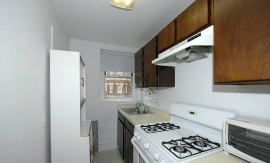
Currently: Narrow and Dated
Re-imagined: Modern, with More Open Space
The Kitchen
The kitchen feels small and cramped, but by knocking out the left-side wall (not load bearing so doable) to create a counter that opens into the living area, the room opens up. The addition of cabinetry with glass doors on the left will allow for additional storage space while still letting light into the room. Weʼd replace the current cabinetry, appliances, and flooring, and add a tiled backsplash for more texture.
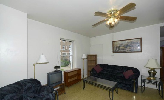
Currently: Small and Enclosed
Re-imagined: Open to the Kitchen
The Living Room
By removing the shared kitchen wall, the living room feels much more spacious. Weʼve added a counter space with stools for extra seating and additional cabinetry with glass doors above the counter. New floors and lighting fixtures are added enhancements to the space.
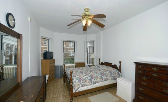
Currently: Spacious but Disorganized Layout
Re-imagined: A Cozy Master Bed
The Bedroom
The bedroom is in pretty decent shape and could simply use some new wood floors and a coat of paint. Weʼd re-arrange the layout to place the bed in the bay window in order to maximize floor space. Finally, weʼd remove the old ceiling fan with overhead lighting in favor of some pendants placed by the bed.
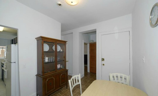
Currently: Dated Looking
Re-imagined: A Simple Dining Area
The Entry/Foyer
The entry area is somewhat narrow, but still allows for a simple dining area just off the kitchen. By updating the floors to a richer wood and repainting the walls and doors, the space can be brightened up. Weʼd also add a new, modern overhead light above the seating area. Finally, removing the bulky buffet/cabinet and replacing it with a more moderately proportioned bench makes the space feel easier to walk into.
Lori Steenhoek is a Digital Artist with over seven years of experience creating architectural renderings. She is the founder of Capital Pixel, a DC-based rendering company, and is currently finishing her Masters thesis in Animation and Visual Effects. She can be reached at lori@capitalpixel.com
Do you know of a home that needs some re-imagining? If so, drop us a line at editor2012@urbanturf.com.
Similar Articles:
* Re-Imagined: A Victorian on the Hill * Re-imagined: Spiffing Up a Hillcrest Mansion * Re-imagined: A 1920s Trindad Row House * Re-imagined: A Truxton Circle Row House Overhauled * Re-imagined: An UrbanTurf Reader Request * Re-imagined: A U Street Row House
See other articles related to: capital pixel, dclofts, lanier heights, re-imagined
This article originally published at https://dc.urbanturf.com/articles/blog/re-imagined_updating_a_lanier_heights_coop/6491.
Most Popular... This Week • Last 30 Days • Ever

In this article, UrbanTurf will explain what special assessments are, how they work, ... read »

In news that we will call unsurprising, the DC area experienced the steepest job loss... read »
A four-story building at the eastern edge of Georgetown's commercial strip is moving ... read »
If you sold your home in the 20016 zip code earlier this year, congratulations — yo... read »

The 500-unit Holiday Inn project moves forward; the White Lotus skyscraper; and the 2... read »
- What Are Special Assessments in Condo Buildings and What Do They Cover?
- DOGE's Toll: DC Area Sheds More Jobs Than Any Metro in the Country
- Six Townhouses, Two Penthouses Proposed for M Street Property in Georgetown
- The DC Neighborhoods Delivering The Biggest Paydays For Home Sellers This Year
- Friday's Must Reads
DC Real Estate Guides
Short guides to navigating the DC-area real estate market
We've collected all our helpful guides for buying, selling and renting in and around Washington, DC in one place. Start browsing below!
First-Timer Primers
Intro guides for first-time home buyers
Unique Spaces
Awesome and unusual real estate from across the DC Metro


