 Re-imagined: A Truxton Circle Row House Overhauled
✉️ Want to forward this article? Click here.
A backyard in Truxton Circle re-imagined.
In Re-imagined this week, Lori Steenhoek helps envision how various features of a Truxton Circle row house (map) could be transformed. The house, built in 1915, already has great features like an open floor plan, high ceilings, and a large backyard. With a few renovations, it could become a truly beautiful home. Check out some of the before-and-after images below to see what Lori would update.
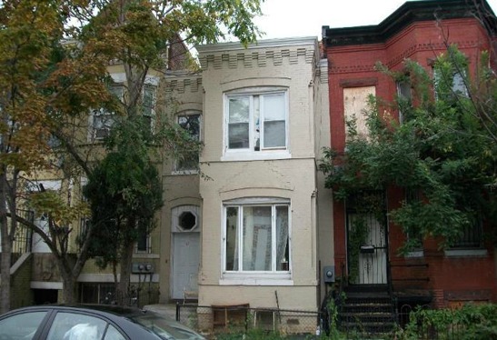
Currently: Needs a Facelift
Re-imagined: Colorfully Updated
The Exterior
The front of the house could use a fresh coat of paint, so we decided to keep the main color the same and simply highlight the horizontal banding and brick detailing over the windows with a black trim accent. The existing front door looks like it has seen better days, so weʼd look for something colorful to replace it, perhaps a salvaged door from Community Forklift. The bay windows, too, would be replaced with large, single-paned picture windows at both levels, allowing lots of light into the home's main rooms. Weʼd keep the unique, hexagon-shaped cutout that is currently above the entry door, and splurge on a custom stained-glass piece of artwork to fit inside it. Something like this would add lots of character to the facade without destroying the existing details. Adding some basic, new address numbers and a porch sconce would complete the front renovations.
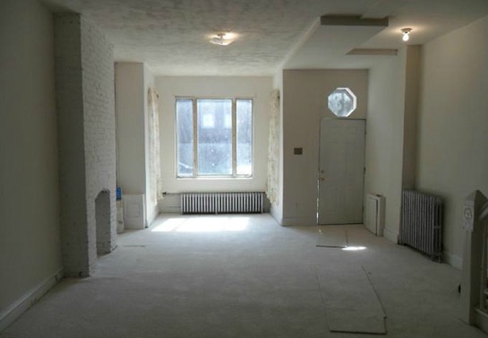
Currently: Spacious But Dull
Re-imagined: Open and Light
The Living Room
The main living area in this house offers tons of potential -- high ceilings and plenty of space that could be configured in different possible layouts. First, weʼd tear out the carpet -- painful to do because it looks brand new, but this space just begs for wood floors. Here, weʼve shown high-gloss, bright white-painted wood floors. However, a dark, deeper wood tone would work equally as well, depending upon the quality and color of what actually exists underneath the carpets. Weʼd keep the current location of the fireplace, which has unfortunately been filled in, and install a gas-controlled, ventless fireplace as a focal point for the main seating area. Neutral-colored paint on the walls and ceilings, as well as a more uniform bulkhead with recessed lighting will tie the room together.
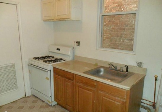
Currently: Outdated
Re-imagined: Overhauled
The Kitchen
Thereʼs not much worth saving in this outdated kitchen. Weʼd take out the linoleum flooring, existing appliances, and old cabinetry in favor of some more modern looking replacements. Here, weʼve chosen warm, solid-wood countertops with a raised-edge sink, white slab-style cabinets, and stainless steel appliances. Next, weʼd add some wider trim around the window and some light-colored wood paneling on the walls to accentuate the new space. Finally, weʼd upgrade the closet door at left to something a little lighter looking.
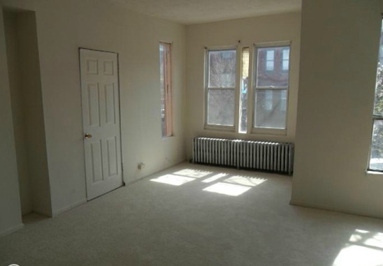
Currently: Odd Configuration
Re-imagined: A New Layout
The Bedroom
At first glance, we couldnʼt figure out where weʼd put the bed in this spacious master bedroom. We started off feeling like it should go in the bay window, but we wanted to keep the detail of the old radiators without blocking them entirely, and we still had the problem of that closet door location at left conflicting with the bed. So, for this update, we ultimately decided to remove the shallow closet on the side wall, and use that extra space to create a built-in niche for the bed, with some shelving and storage above. This would allow the bay window to become a small sitting area. You would lose a bit of closed-off closet space, but some of that has been added back in with the above-bed shelves. This shelving system could be re-configured a number of different ways to include more “cabinet” doors for more discrete storage, or with additional, smaller cubbies. The new picture window, as mentioned previously, would allow for an open view of the street below and let in lots of sunlight. Again, weʼd take up the carpet in favor of wood floors, and give the walls a fresh coat of paint.
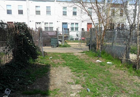
Currently: Large, Deep and Underutilized
Re-imagined: Backyard Oasis
The Backyard
This yard, which feels nice and long for a DC row home, would make a great outdoor room with just a little bit of planning and some simple landscaping features. First, weʼd add a high privacy fence all around to define the space. Next, weʼd add a wood trellis to one side of the yard, floating it over top of a raised paver area for outdoor seating. A meandering stone pathway would lead to the rear of the yard. By including a sliding gate at the middle rear panel of the fence, you could still access the alley by way of the backyard. Near the house, we would include another paved patio flush with the ground, leaving room here for additional seating and a grill. With the addition of some string lighting, this yard would be the perfect place to host an evening get-together.
Lori Steenhoek is a Digital Artist with over six years of experience creating architectural renderings. She is the founder of Capital Pixel, a DC-based rendering company, and is currently finishing her Masters thesis in Animation and Visual Effects. She can be reached at lori@capitalpixel.com
Do you know of a home that needs some re-imagining? If so, drop us a line at editor2012@urbanturf.com.
Similar Articles:
* Re-imagined: Fixing Up a Trinidad Fixer-Upper * Re-imagined: An UrbanTurf Reader Request * Re-imagined: A U Street Row House
See other articles related to: dclofts, re-imagined, truxton circle
This article originally published at https://dc.urbanturf.com/articles/blog/re-imagined_a_truxton_circle_row_house_overhauled/5444.
Most Popular... This Week • Last 30 Days • Ever
This week’s Best New Listings includes a three-bedroom Friendship Heights farmhouse... read »

In April, UrbanTurf looked at programs in the District that help homebuyers defray ... read »
Add another residential development to the growing pipeline in the Courthouse section... read »
The building code reform could quietly reshape the way the District builds housing on... read »
What is Zillow Preview; who are DC's speed cameras catching; and who is buying vacant... read »
- Best New Listings: A Friendship Heights Farmhouse; A Bright Kalorama Two-Bedroom
- First-Timer Primer: Maryland’s Home Buyer Assistance Programs
- 18-Story, 341-Unit Apartment Building Pitched Near Courthouse Metro
- DC Council Advances "One Front Door" Act, Opening the Door to Taller Single-Stair Buildings
- Monday's Must Reads
DC Real Estate Guides
Short guides to navigating the DC-area real estate market
We've collected all our helpful guides for buying, selling and renting in and around Washington, DC in one place. Start browsing below!
First-Timer Primers
Intro guides for first-time home buyers
Unique Spaces
Awesome and unusual real estate from across the DC Metro


