 Unique Spaces: Throwing a Curve at 550 Square Feet
✉️ Want to forward this article? Click here.
Unique Spaces is a series on UrbanTurf where we take a look at properties that could be considered “one-of-a-kind” in the DC area. If you have a home that you think fits the bill, send an email to editor2010@urbanturf.com. See all of our past Unique Spaces articles here.
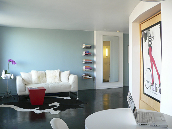
The new curved wall in a 550-square-foot studio
When Interior Designer Robert Kelly was transferred by his company to Washington, he immediately set about looking for a place to call home. After exploring many of DC’s popular neighborhoods he quickly narrowed his search to the Waterfront neighborhood in Southwest because of its mid-century modern architecture. While many people these days are quick to criticize this period of architecture, there were definitely some good things that came out of it too. To Robert, mid-century architecture recalls a country that optimistically believed in the possibilities of the future and modernity rather than constantly looking backward to the past.
Having moved to DC in 2006, Robert was confronted with an aggressive housing market that forced him to downsize from a three-bedroom house in Atlanta to a studio apartment here. He told his agent that to compensate for such a dramatic downsizing, his new home in DC would need to have something special, like a really great view or something architecturally distinctive.
After being outbid on three different units in Southwest, he was finally able to purchase a 554-square-foot condominium studio unit in the Tiber Island community. Losing on the previous units turned out to be a blessing in disguise: the unit he purchased has sweeping city vistas, including fantastic views of the Capitol dome, the Washington Monument, the Washington Channel, and neighborhood landmarks such as the new Arena Stage Theater.
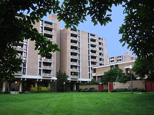
One of the Tiber Island towers
The Tiber Island community where Robert wound up buying was designed by noted architects Keyes, Lethbridge and Condon and was built in 1965 with four high-rise towers interlocking in a pinwheel formation into a large central plaza. The property encompasses smaller blocks of two and three-story town houses in each of the four quadrants defined by the towers. The Tiber Island design won the American Institute of Architects award for Multi-Family Residential design in 1966. However, the interior of the unit hadn’t been touched since the sixties and desperately needed updating.
Robert started by completely gutting the unit, including the popcorn ceilings and woefully outdated kitchen and bathroom. Organizationally the old plan was an awkward arrangement of volumes that defined the bathroom, a dressing area, and the kitchen. While keeping the locations of fixtures in the kitchen and bathroom in place, Robert reconfigured the spaces by inserting what is now the unit's signature feature: a floor-to-ceiling curved wall from the entry door through the unit to the entry of the kitchen. The curved wall divides the functional spaces of the unit from the living space, thereby visually simplifying the layout. This simple gesture eliminated the long entry hall and opened up the views from the front door through to the rest of the unit and to the city views beyond.
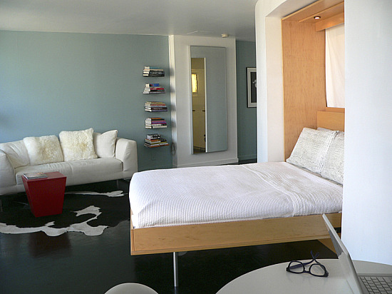
With the Murphy bed down
A Murphy bed was intentionally recessed into the curved wall so that the view from the bed is of the capitol dome. The sofa was placed to take advantage of the spectacular Washington Monument view. Robert got a rather unexpected surprise on the first Fourth of July in his new home when he realized that he had front row seats to the fireworks on the National Mall.
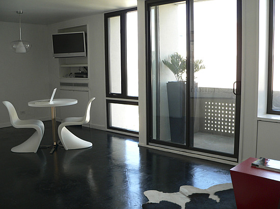
Floor-to-ceiling windows and the refinished floor
The unit faces north and large amounts of floor-to-ceiling glass allow the unit to be flooded with soft “artist light” throughout the day. Making the best of this light, Robert chose to keep the color palette light to maximize the amount of light and feeling of openness.
Because the existing oak wood floors were in good condition, they were retained. The oak grain and coloration unfortunately created a very busy pattern on the floor so in order to tame this pattern and ground the unit, Robert refinished the floors utilizing an ebony black stain and several coats of high gloss urethane. The grain of the wood is still visible through the stain but is subdued by the uniform color of the ebony.
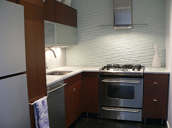
Kitchen
In order to keep the unit from feeling too cold he incorporated eucalyptus wood cabinetry in the kitchen. Honed Carrara marble was selected for the counters and full height backsplash. The honed finish of the marble adds warmth and translucency that a polished stone surface wouldn’t be able to provide. The wall behind the stove is clad in a CNC-routed MDF panel that he painted a pale aqua to complement the tones of the wood cabinetry. Upper cabinets were left off this wall to enhance the sense of openness in the kitchen, while a full height pantry unit was added in the space that was captured by the curved partition to offset their loss.
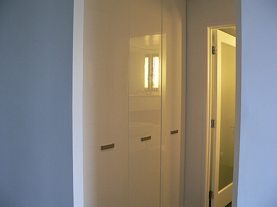
New cabinets in the dressing area
Having lived in New York twice before, Robert was well aware of the old adage for small spaces, “If you can’t go out, go up.” Robert adhered to this rule by incorporating several floor-to-ceiling cabinets in the dressing area, finished with high gloss white lacquer, which help to make the absolute most of storage. The white finish keeps this small dressing area feeling open and bright. Additional long-term storage space was created behind the Murphy bed for miscellaneous things like luggage. A coat closet tucked behind the curved wall by the front door rounds out the storage.
In the bathroom, rectangular glass mosaic tiles in shades of sea glass and pale aqua line the new walk-in shower that replaced a way-too-small tub. “Being 6’-2” the tub was ridiculous, as only half of my body could be covered by water at any given time,” Robert said. “So I ripped it out and now have a spacious shower in its place.”
In keeping with the mid-century design, a long, low horizontal medicine cabinet with sliding doors was retained and refinished. A dual-flush toilet and low-flow water fixtures were installed to conserve energy.
Robert is quite pleased to be living in his unique home, in one of the city's most architecturally unique neighborhoods. He realizes that in any other city, a place like his on the waterfront with access to so many different amenities would more than likely be unattainable. For him, this is ideal city living.
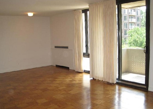
PostScript from UrbanTurf. We coincidentally selected an almost identical unit (550-square-foot studio at Tiber Island) as one of this week's Best New Listings. For the sake of comparison, take a look at that unit and Robert's renovation, side by side:

See other articles related to: dclofts, southwest waterfront, studios, unique spaces
This article originally published at https://dc.urbanturf.com/articles/blog/unique_spaces_throwing_a_curve_at_550_square_feet/2243.
Most Popular... This Week • Last 30 Days • Ever

In this article, UrbanTurf will explain what special assessments are, how they work, ... read »
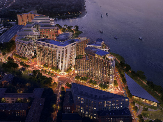
HRP Group is taking its plans for the first three building blocks and two major open ... read »

Today, UrbanTurf heads down to a portion of Southwest DC to see what large residentia... read »

The average homeownership tenure in the DC metro hit a record high in the first quart... read »
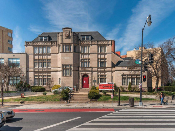
The project proposed for a limestone mansion and adjacent buildings at the corner of ... read »
- What Are Special Assessments in Condo Buildings and What Do They Cover?
- 2.5 Million Square Feet: One Of The Biggest Projects In The DC Area Advances
- Groundbreakings and Gridlock: The Southwest DC Residential Pipeline in 2026
- How Long Are DC Homeowners Staying Put? A Long Time
- 90-Unit Condo Project Pitched In Mt. Pleasant Gets Key Approval
DC Real Estate Guides
Short guides to navigating the DC-area real estate market
We've collected all our helpful guides for buying, selling and renting in and around Washington, DC in one place. Start browsing below!
First-Timer Primers
Intro guides for first-time home buyers
Unique Spaces
Awesome and unusual real estate from across the DC Metro
