What's Hot: 134-Unit Residential Project Planned for Long-Vacant Chevy Chase Site on Connecticut Avenue
 Re-imagined: An UrbanTurf Reader Request
✉️ Want to forward this article? Click here.
A re-imagined room at 27 Quincy Place NW
In Re-imagined this week, Lori Steenhoek of Capital Pixel helps "re-imagine" a home at 27 Quincy Place NW (map) that was sent in by the owner/UrbanTurf reader.
The 1895 Victorian home has been gutted and is ready for a complete transformation. The property was purchased in September 2010 by two close friends and longtime DC residents who saw lots of potential in the home, despite the fact that it had been an informal rooming house for a number of years and was in a state of considerable disrepair. They carefully gutted the property, leaving as many original details as possible, and debated between restoring its original character, creating a more modern design, or some kind of hybrid mixing old and new. They also considered reconfiguring the basement as a separate rental unit.
Before any designs took shape, however, the owners experienced career and job transitions and are now letting their investment go instead of completing the renovation. The house is currently for sale in its fully gutted state.
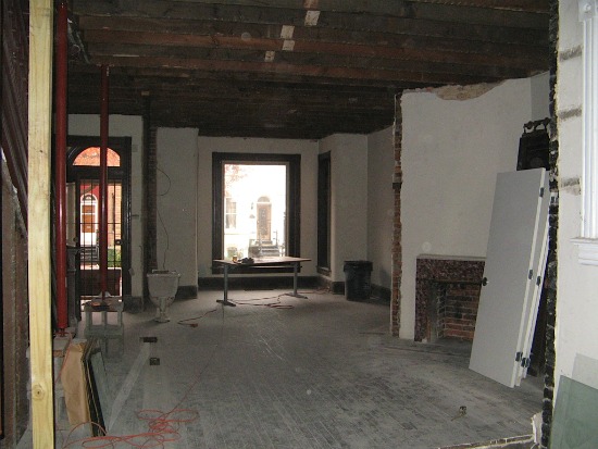
Currently: Bare But Spacious
Re-imagined: A Series of Comfortable Living Spaces
The Living Room
The main room of the home has an open floor plan that leads into the kitchen in the rear of the property. We decided to keep the layout open and flexible as one large living room, and centered the space around the double-sided fireplace. We added a raised hearth with room to store logs beneath and restored the original brick from floor to ceiling. Recessed lighting and a bulkhead above add further effect.
In this rendering, weʼve shown one L-shaped couch, but there is also room for another seating area to face the other side of the fireplace. Ideally, the new owner might look for custom furniture that could be easily rearranged to accommodate a few different setups around the fireplace. We've kept the carefully-preserved trim, detailing and railings around the bay windows, front door, and stairs, and refinished the original wood flooring. It was tempting to try and keep the exposed beams in the ceiling as a design element, but in the end, we thought it would overwhelm the long space and decided against that idea. The result is a series of connected spaces, from the breakfast bistro table in the front, to a couple of seating areas around the fire, to the kitchen in the rear: a modern, open layout with hints of the original details throughout.
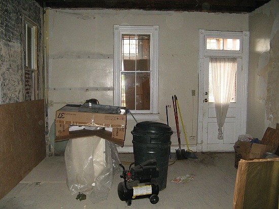
Currently: In Need of Everything, Including a New Layout
Re-imagined: Light and Organized With Custom Details
The Kitchen
The kitchen is often the most important room in the home, and this one is no exception located at the end of a very linear floor plan. When you enter the home and look into the length of the space, the kitchen is where your eyes land.
For the update, we kept the window and door trim intact, repainted those elements, added trim at the ceiling to match, and more recessed lighting above the island. To allow for more cabinet space, we decided to keep the original window at left bricked-in and closed over, as had been done by previous owners. Blue-grey wood paneling on the walls adds some vertical detailing that is also picked up in the cabinetry of the island. Other design options include the custom range hood, a built-in wine refrigerator underneath the countertop, and an apron kitchen sink.
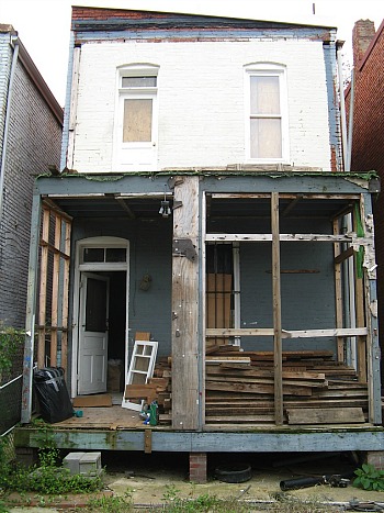
Currently: Deteriorating
Re-imagined: A Sunny Porch and Balcony
The Rear of the House
The back part of the home is in need of some major work. First, we would tear down the existing wooden porch structure to make room for a more open one. Weʼd look to incorporate Victorian-style columns and railings, something you could likely find at an architectural salvage warehouse, to create the new structure. These would be similar in detail to railings that were left intact throughout the home. A couple of wooden stairs leading down into the grassy backyard would make a good ledge for some potted plants and greenery. For the upper balcony, weʼd make it deep enough for a small table and chairs, a good place to read the paper or have a cup of coffee.
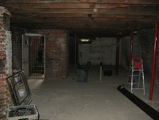
Currently: Open and Unfinished
Re-imagined: A Studio Rental Unit
The Basement
We deemed the basement, with a private entrance from the rear, perfect for conversion into a separate rental unit. We restored part of the original brick wall to keep as an accent, and then added brand new flooring, drywall, and ceilings to create a studio-style rental.
Lori Steenhoek is a Digital Artist with over six years of experience creating architectural renderings. She is the founder of Capital Pixel, a DC-based rendering company, and is currently finishing her Masters thesis in Animation and Visual Effects. She can be reached at lori@capitalpixel.com
Do you know of a home that needs some re-imagining? If so, drop us a line at editor2011@urbanturf.com.
See other articles related to: bloomingdale, dclofts, re-imagined
This article originally published at https://dc.urbanturf.com/articles/blog/re-imagined_an_urban_turf_reader_request/4644.
Most Popular... This Week • Last 30 Days • Ever
The former Washington Commanders owner's 16.5-acre estate is set to return to the mar... read »

Cash-out refinancing is a popular financial strategy that allows homeowners to conver... read »
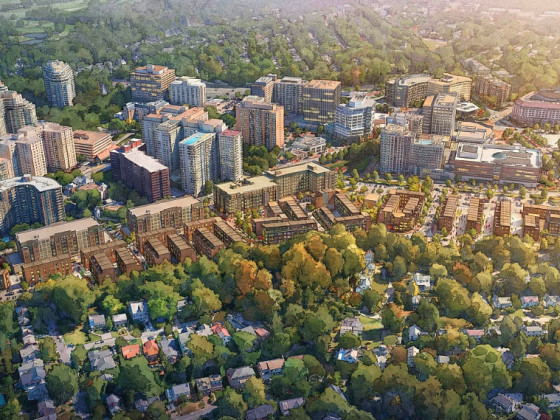
A dormant stretch of Connecticut Avenue in Chevy Chase may soon see new development.... read »
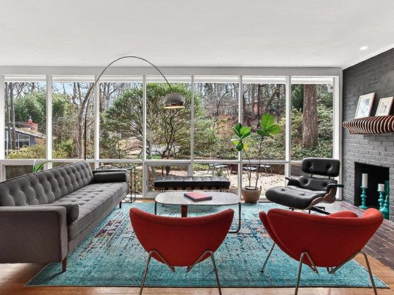
In this week's Above Asking, we feature a mid-century modern home in Alexandria that ... read »
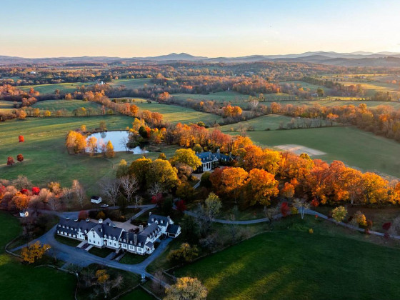
The greater DC luxury housing market's most expensive recent sales in 2026 span the f... read »
- Dan Snyder's River View Estate To Return To The Market For Just South Of $50 Million
- How Does Cash-Out Refinancing Work?
- 134-Unit Residential Project Planned for Long-Vacant Chevy Chase Site on Connecticut Avenue
- Above Asking: A Bit Of A Premium In Hollin Hills
- Halcyon To Horse Farm: The 3 Most Expensive Properties Sold In The Greater DC Area In 2026
DC Real Estate Guides
Short guides to navigating the DC-area real estate market
We've collected all our helpful guides for buying, selling and renting in and around Washington, DC in one place. Start browsing below!
First-Timer Primers
Intro guides for first-time home buyers
Unique Spaces
Awesome and unusual real estate from across the DC Metro


