 The Graph That Illustrates DC's Housing Production Versus Population Growth
✉️ Want to forward this article? Click here.
As DC continues its efforts to drum up support for Mayor Bowser's housing production goals, the Office of the Deputy Mayor for Planning and Economic Development has released a graph* showing how — or whether — approval of housing units has kept pace with population growth in the city.
Below is the graph, along with a few observations.
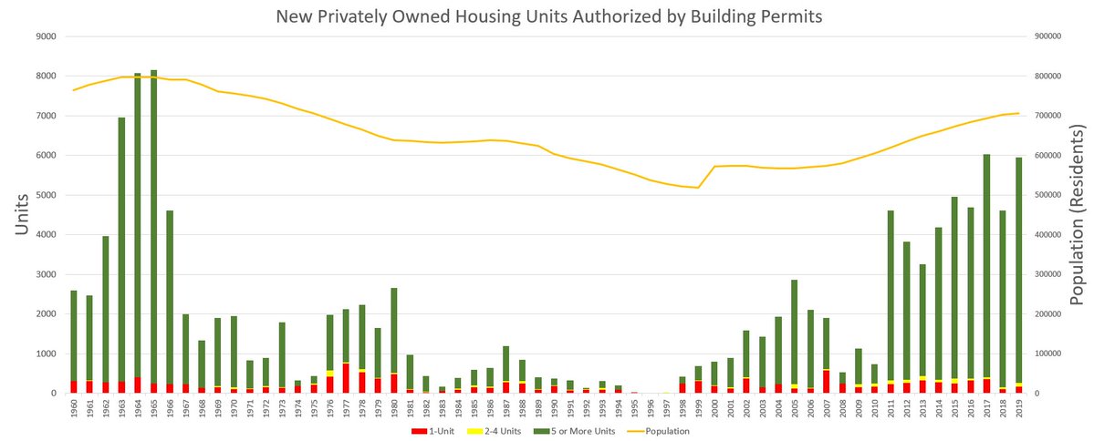
- When DC's population was at its height, approaching 800,000 residents in 1964-65, at least 8,000 housing units were approved annually. This wasn't sustained, however, dropping to 4,500 units in 1966 and not reaching a comparable level, or even exceeding 3,000 units, until 2011.
- The population in the city bottomed out in 1999-2000, but by this time, approved units had already begun trending upward again. That continued until 2008, when approvals plummeted from just under 2,000 units a year to roughly 500 amid the Great Recession.
- Approved housing units shot up from roughly 800 in 2010 to over 4,500 in 2011 as population growth resumed. Permitted units have fluctuated since. The most recent peak was in 2017, when just over 6,000 units were permitted.
- With just over 4,500 units approved, 2018 was a blip year in the data, perhaps reflecting the impact of the wave of planned-unit development appeals.
story continues below
loading...story continues above
Now, for a little inferring from UrbanTurf.
If one guesstimates based on the graph that an average of 5,500 units were permitted between 2017 and 2019, one could expect a total of 33,000 units to be permitted between the beginning of 2020 and the end of 2025, short of the mayor's goal of producing 36,000 units by 2025. However, if the goal were to get 36,000 units approved by the end of 2025, the city is on pace to be just 3,000 units short, which could be compensated for if outstanding appeals are resolved and the current Comprehensive Plan amendment cycle succeeds in creating more growth-friendly conditions.
*The graph was released as part of the city's Continuing Conversations on Housing series to examine the intersection between the enduring impact of racist and exclusionary housing policy with current land use policy and housing supply constraints. A third event was held this past Saturday at the Howard Theatre.
Thumbnail image courtesy of Ted Eytan.
See other articles related to: building permits, comp plan, comprehensive plan, dc comprehensive plan, dmped, housing production, housing production targets, mayor bowser
This article originally published at https://dc.urbanturf.com/articles/blog/the-one-chart-that-ilustrates-dcs-housing-production/16439.


UrbanTurf Listings showcases the DC metro area's best properties available for sale.

Most Popular... This Week • Last 30 Days • Ever

In this edition of First-Timer Primer, we look into the question of how to determine ... read »

A Roth IRA is one of those accounts that people feel is totally off limits until you ... read »

This is one of the more intriguing adaptive reuse proposals of the year.... read »

On this day of 100+ degree heat, we take a look at a novel proposal aiming to bring r... read »

Construction has begun on a long-planned residential project along the H Street Corri... read »


- First-Timer Primer: Is This Condo Building Financially Healthy?
- First-Timer Primer: How A Retirement Account Can Help Buy A Home
- The Plan To Turn A Rock Creek Park Estate Into A Suburban-Style Pool and Tennis Club
- The Plan To Throw Shade On Cleveland Park
- 49-Unit H Street Project Breaks Ground As Corridor Ponders Its Future
DC Real Estate Guides
Short guides to navigating the DC-area real estate market
We've collected all our helpful guides for buying, selling and renting in and around Washington, DC in one place. Start browsing below!
First-Timer Primers
Intro guides for first-time home buyers
Unique Spaces
Awesome and unusual real estate from across the DC Metro