 Re-imagined: Spiffing Up a Hillcrest Mansion
✉️ Want to forward this article? Click here.
A re-imagined room in Hillcrest.
In Re-imagined this week, Lori Steenhoek helps re-envision an expansive, four-story Tudor at 3128 Westover Drive SE (map) on the northern edge of Hillcrest. Built in 1940, this home has over ten rooms, cathedral ceilings, two fireplaces, exposed wood beam construction, cork and slate flooring, double height spaces, and elaborate stone features throughout. The grounds include a half-acre lot with fountains, an amphitheater, extensive hardscaping, and a maze of walkways.
Similar to other homes we’ve looked at in Re-Imagined, the description notes that the property has "rehab potential" and “needs work”, but this time with a much larger scope and asking price. As such, this home isn’t for your average buyer, and we suspect it’s been on the market so long (250+ days) due to the size and the biggest challenge of all: how to best utilize each of the rooms. So, rather than providing extensive modifications to the home, we concentrated on how we’d stage and slightly improve the spaces for potential buyers who might have a hard time seeing how this house could look due to the unusual layout and architecture.
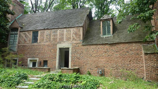
Currently: Overgrown
Re-imagined: Landscaped
The Exterior
The front of the house is looking a little unkempt, mostly due to the overgrown yard and weeds. Weʼd start by replacing the small entry steps with some more natural looking stone ones, and line the path with shrubs. Weʼd extend the brick retaining walls across the front of the house, and add plantings as well for a more defined edge. For the face of the house, weʼd repaint the wooden beams and window trim with a black or chocolate color to emphasize the Tudor characteristics that are now barely noticeable. To add some detail to the blank brick wall at the right, weʼd incorporate a vertical green wall or some growing ivy. Finally, the entry way could use a new door and some lighting to make it look more inviting.
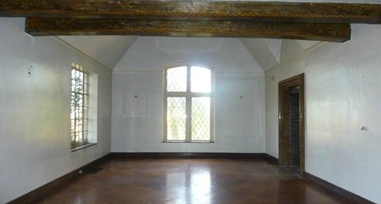
Currently: Bare
Re-imagined: A Grand Dining Room
Double-Height Space with Cathedral Ceilings
This room offers a lot of potential -- slate floors, incredibly high ceilings and detailed, exposed wooden beams. We decided to lay it out as a dining room with an oversized table and plenty of seating for guests, and let the space speak for itself. Weʼd paint the end wall an accent color, and add wall lighting or sconces to create a focal point in the room.
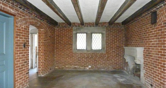
Currently: Feels Vacant
Re-imagined: A True Study
The Study
With the fireplace and relatively lower ceilings, this room struck me as an intimate place that would work well as a small library or study, just off the entrance to the home. Again, weʼd keep most of the original detailing the same, but give the beautiful floors a good cleaning, repair the fireplace and add a new hearth. The ceiling beams and exposed brick are beautiful as-is, so weʼd simply arrange a table and some seating and add some wooden built-in bookshelves to the far wall.
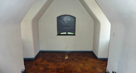
Currently: An Unusual Layout
Re-imagined: A Stylish Master Bedroom
The Bedroom
What an amazing space to fall asleep in every night! This room would make a beautiful master bedroom, especially with the cozy little nook that would perfectly fit a bed and two nightstands. Weʼd paint the three walls a neutral accent color to define the nook, and add some dramatic lighting above. The interior window (which overlooks the double-height space on the far side of the dining room) is an interesting feature that weʼd keep, but perhaps add some stained-glass to create privacy while still allowing filtered light into the space. The side niches would be perfect for dressers or even a built-in window seat.
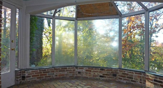
Currently: Needs Some Repairs
Re-imagined: A Tranquil Indoor Space
The Sunroom
Despite being surrounded by glass walls and a green landscape view, this room feels cold and uninviting in the original image. Weʼd fix the broken glass panes, and perhaps make the two shorter windows operable, which could allow fresh air in during the spring or fall months. Though this space is surrounded by tall shade trees, we imagine the sunlight would still heat it up fairly quickly, so weʼd hang curtains around the perimeter to be able to control the light coming in. Some cozy chairs and a large circular rug would pull the space together as a room to sit and read and relax.
Lori Steenhoek is a Digital Artist with over six years of experience creating architectural renderings. She is the founder of Capital Pixel, a DC-based rendering company, and is currently finishing her Masters thesis in Animation and Visual Effects. She can be reached at lori@capitalpixel.com
Do you know of a home that needs some re-imagining? If so, drop us a line at editor2012@urbanturf.com.
Similar Articles:
* Re-imagined: A 1920s Trindad Row House * Re-imagined: A Truxton Circle Row House Overhauled * Re-imagined: An UrbanTurf Reader Request * Re-imagined: A U Street Row House
See other articles related to: dclofts, hillcrest, re-imagined
This article originally published at https://dc.urbanturf.com/articles/blog/re-imagined_spiffing_up_a_hillcrest_mansion/5639.
Most Popular... This Week • Last 30 Days • Ever

DC's homebuyer assistance programs can be a bit complex. This edition of First-Timer ... read »

Plans for a major development along Wisconsin Avenue are being pushed back.... read »
The project will bring a pair of two-bedroom residences to each of the building's thr... read »
A limestone mansion in Mount Pleasant is getting a second act — this time as 90 res... read »
With the official beginning of spring, UrbanTurf is taking a look at what we think wi... read »
- First-Timer Primer: DC's Home Buyer Assistance Programs
- B.F. Saul Pumps the Brakes on 350-Unit Bethesda Development
- Dupont Circle's Long-Vacant Pakistani Embassy Is Going Residential
- 90-Unit Condo Project At Historic 16th Street Mansion Looks To Move Forward
- New Listings, Lower Prices And Those Rates: The Charts That Define The Spring Market in DC
DC Real Estate Guides
Short guides to navigating the DC-area real estate market
We've collected all our helpful guides for buying, selling and renting in and around Washington, DC in one place. Start browsing below!
First-Timer Primers
Intro guides for first-time home buyers
Unique Spaces
Awesome and unusual real estate from across the DC Metro


