What's Hot: Lease-to-Own, Lot Splits, and a Faster Permit Process: Brooke Pinto Introduces New DC Housing Bill
 One on One: KUBE Architecture
✉️ Want to forward this article? Click here.
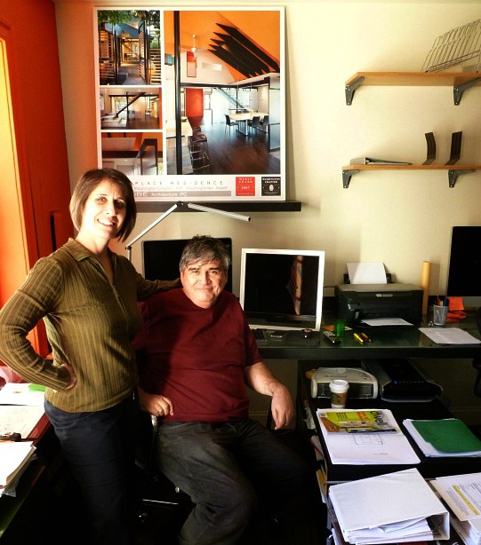
Janet Bloomberg and Richard Loosle-Ortega
In One on One, UrbanTurf sits down with all types of folks who have their fingers in some aspect of the DC residential real estate world to learn a little bit more about what they do. Today, we interview Richard Loosle-Ortega and Janet Bloomberg, principals at KUBE Architecture, a DC firm that is notable for its colorful, modern designs. (If you have been inside the frozen yogurt store, TangySweet, then you know their work). We met at their office, which is filled with materials like Virock and a translucent, amber-like screen, and talked to them about their designs, current projects, and working modern architecture into historic DC buildings.
When did you start KUBE?
Richard Loosle-Ortega: I was teaching at Catholic University full-time, and Janet was teaching part-time and doing her own architecture. We had the same sort of aesthetic, and decided we could work together, so we formed KUBE in 2005. We do 85 percent residential, and the rest is commercial: spas, restaurants and boutique retail.
Can you tell us about your aesthetic?
RL: I used to tell clients – if you want something traditional, like a colonial house, I’ll draw that as long as you dress in colonial dresses and ride a horse and buggy. Come on, its 2012! Why does architecture have to look old and everything else look new?
So, we have a warm, modern aesthetic. Janet has traveled a lot to India and I have my Latin heritage, so we love color and texture. We also both used to work in commercial, and a lot of the materials we used there—exposed steel, aluminum, ceramic tile—are part of modern architecture. So we bring those in and wed them with color and other elements like wood.
Janet Bloomberg: In India, I was very influenced by the saturated color. I never used color – at architecture school it was all white. A lot of modern architects are very afraid of color, but we believe strongly that it helps give warmth and character.
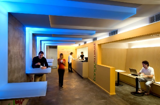
TangySweet
Besides TangySweet, have you designed anything else readers might recognize?
RL: The Red Velvet Cupcake locations in Chinatown and Reston.
What are some interesting projects that you are working on?
RL: Janet is busy right now with a guy who is converting an Irving Street row house into a 4-unit condo building. He’s a young guy who is developing it on his own.
JB: It’s his first project. He selected us because he thinks our work is not DC, but looks more like New York or Europe.
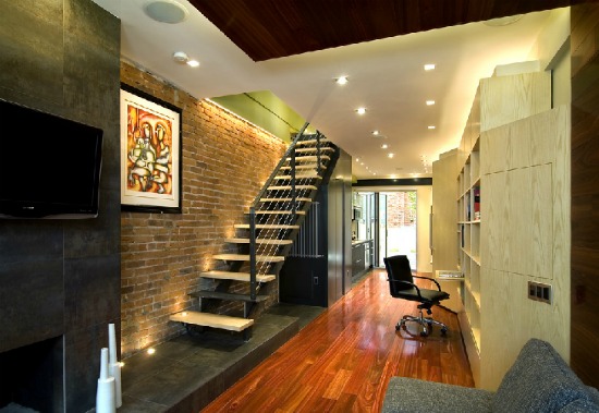
A Foggy Bottom row house
Where do you see DC going, architecturally?
RL: DC has a lot of historic buildings, but people don’t live like that anymore (that is, in closed, dark rooms). All our clients want their homes to be open and bright, but they don’t want to move to the suburbs. So, there has been this shift toward a more modern aesthetic. When Janet and I started five years ago, there wasn’t a lot of competition among modern architects. Now, there are more clients who want it.
What are the limitations of modern design in DC?
RL: The obvious limitation is the width, with very narrow spaces in DC row houses. To open up the space more, you need to bring in light from above, so we use a lot of translucent panels to offer privacy but let light through. We frequently use solar tubes in the ceiling, which are very small and affordable and exaggerate the sunlight.
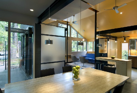
A lot of people are under the impression that a modern looking home is more expensive than a more traditional home. Is that true?
RL: Not necessarily. The problem is that contractors don’t understand how to work with modern details. The materials aren’t more expensive, but the craft and labor has to be better. For example, in a modern home, you have a floor meeting the walls, and you don’t want to hide the seam with a bunch of molding. You have to lay the floor nice and tight and clean. Crown molding is a great way to hide stuff – with modern architecture you have to be much more careful, and a lot of contractors are not used to that.
Do you try to include energy efficient design?
RL: We use low VOC paint and materials like recycled rubber, bamboo and cork. Sometimes it costs more to be green and it’s not worth the tradeoff. I was looking at a counter top material that was a composite of different wood and was very green, but shipping it from Washington state was more expensive than the material itself, and it used energy just to ship it, so I gave up on it.
You mentioned in our article last year about how homes will look in the future that the city moves slowly, architecturally. Why is that, and is it changing?
RL: It’s nice to have the mixture of old and new, but a lot of DC is just old. It’s not like California and New York, where people aren’t caught up in having history around them. Here, somehow, if you look historic, you’re more important. There are a lot of people in DC who can’t move away from the heavy wood and traditional stuff. But with so many people coming in from Europe and other places, that is gradually changing.
This interview has been edited and condensed.
This article originally published at https://dc.urbanturf.com/articles/blog/one_on_one_kube_architecture/5043.
Most Popular... This Week • Last 30 Days • Ever

In this article, UrbanTurf looks at the estimated annual maintenance costs associated... read »
A Home Equity Line of Credit, commonly referred to as HELOC, is a borrowing product t... read »
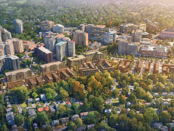
Developer EYA will bring its redevelopment plans before the Montgomery County Develop... read »
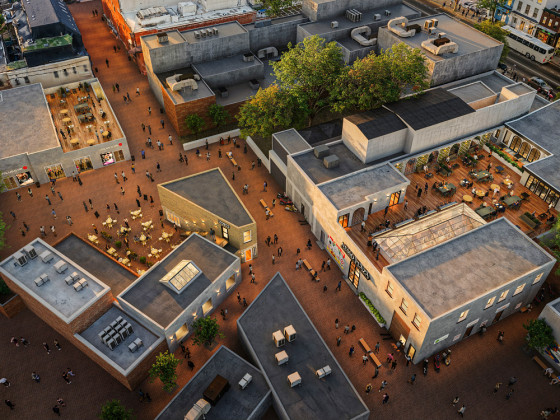
Nesso Plaza is scheduled to open early next year and several tenants have already sig... read »
DC's construction decline; the redevelopment plans along Richmond Highway; and an inf... read »
DC Real Estate Guides
Short guides to navigating the DC-area real estate market
We've collected all our helpful guides for buying, selling and renting in and around Washington, DC in one place. Start browsing below!
First-Timer Primers
Intro guides for first-time home buyers
Unique Spaces
Awesome and unusual real estate from across the DC Metro


