 Project Tracks Income by Metro Line in DC
✉️ Want to forward this article? Click here.
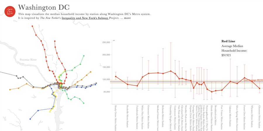
Click to enlarge.
A new Massachusetts Institute of Technology (MIT) project tracing income by DC’s Metro lines and stations offers a really interesting way to look at median income in the region.
The tool (which you can check out here) comes from MIT’s You Are Here project. It turns the Metro map into an interactive graph that lists median income per station and per line.
“…Transit networks are powerful orientation features,” MIT’s researchers write. “Because they are so familiar, they form a nice backbone over which we can communicate data in an intuitive way.”
The map relies on Census data segmented by blocks to show the median incomes. “Wealthier” lines and stations are in the northwest center of town. The further out you go — and the further east — the more incomes drop. As Wonkblog points out, the Orange Line has the highest median income, at $97,236; the brand-new Silver Line, which runs through a lot of wealthy suburban areas, is second, at $92,205. But a stop on the Orange Line, Minnesota Avenue, has the lowest median income of any station, at $33,947.
The Green Line has the overall lowest median income, at $65,619.
This article originally published at https://dc.urbanturf.com/articles/blog/mit_project_tracks_income_by_Metro_line/9451.


UrbanTurf Listings showcases the DC metro area's best properties available for sale.

Most Popular... This Week • Last 30 Days • Ever

In this edition of First-Timer Primer, we look into the question of how to determine ... read »

This is one of the more intriguing adaptive reuse proposals of the year.... read »

The developer wants to transform the 1960s motor lodge into "Union Market Cabanas" �... read »
The Archdiocese of Washington is asking DC's Board of Zoning Adjustment to sign off, ... read »

This week we bring back What X Buys You as UrbanTurf takes a look at how far an $850,... read »


- First-Timer Primer: Is This Condo Building Financially Healthy?
- The Plan To Turn A Rock Creek Park Estate Into A Suburban-Style Pool and Tennis Club
- From Motel 6 to "Union Market Cabanas": Interim Plans Filed for Union Market Site
- Archdiocese Seeks to Revive 80-Townhome Plan In North Michigan Park
- How Far $850,000 Goes In The DC-Area Housing Market
DC Real Estate Guides
Short guides to navigating the DC-area real estate market
We've collected all our helpful guides for buying, selling and renting in and around Washington, DC in one place. Start browsing below!
First-Timer Primers
Intro guides for first-time home buyers
Unique Spaces
Awesome and unusual real estate from across the DC Metro