 Re-Imagined: Refreshing a Mount Pleasant Rowhouse
✉️ Want to forward this article? Click here.
Earlier this month, after a several month hiatus, UrbanTurf returned with our Re-Imagined series, where local architectural visualization firm Capital Pixel helps "re-imagine" what a DC area home in need of renovations could look like one day. This week, Capital Pixel's Lori Steenhoek and Cassie LaPorte go to work on a 1915 Federal style, semi-detached home in Mount Pleasant. It features 2300 square feet of space, though the basement and attic are currently unfinished. Though much of the house is in decent shape, there are a few things theyʼd update:
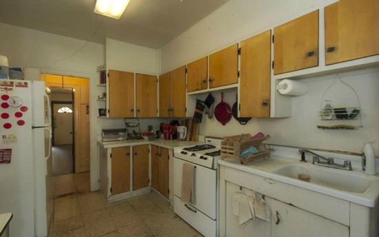
Currently: Dated and Dingy
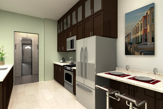
Re-imagined: Modern, with Extra Space
The Kitchen
The kitchen feels outdated with mismatched cabinetry, older appliances, and a worn down floor. Weʼd start by tearing out the linoleum floor tiles and replacing them with new hardwood. Then, weʼd rearrange the layout a bit to allow room for some bar stool seating in the foreground and more countertop work area at left. Taking advantage of the high ceilings, extra storage space could be added with another level of upper cabinetry. We chose dark cabinetry to give the room a rich feel, and a light green accent wall adds a hint of color.
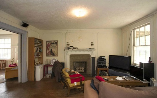
Currently: Messy Layout
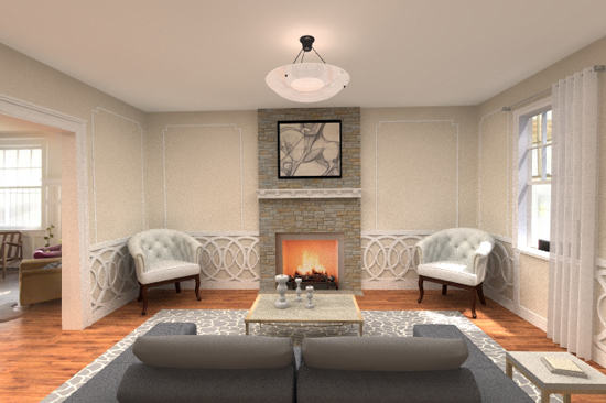
Re-imagined: Organized Layout with New Details
The Living Room
The living room is currently suffering from a strange layout that makes the room feel off-centered, and the taller furniture hides the wall detailing. If new, lower furniture was rearranged around the fireplace, it would open up the space and allow the beautiful trim details on the wall to be seen. Weʼd play these details up by painting the walls a tan color and keep the trim white, adding some wainscoting detailing below the chair railing to give the room a more formal feel. Weʼd play up the verticality of the fireplace with some new stone veneers that would go to the ceiling, while keeping the old mantle intact. A more substantial ceiling pendant would complete the transformation.
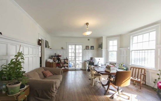
Currently: An Odd Layout
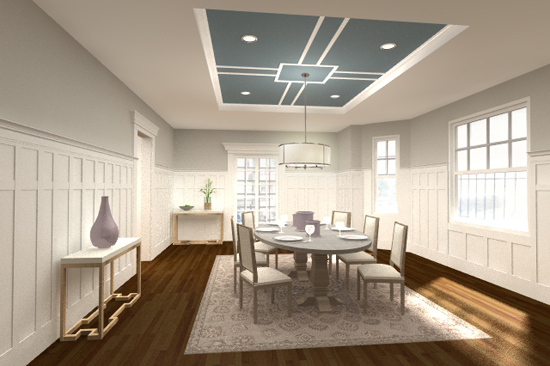
Re-imagined: A Grand Room for Entertaining
The Dining Room
This room is currently being used as some sort of hybrid dining room/sitting room/office space, but we think it would make the most sense as a dining area. Weʼd center a large table in the middle of the room, again letting the detailed wall trim and panelling be the highlight of the space. Weʼd paint the wall area above the trim a darker shade of grey to add contrast. A recessed ceiling with a pop of color and a simple hanging chandelier would bring some drama to the room.
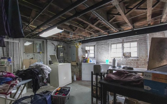
Currently: Cluttered and Disorganized
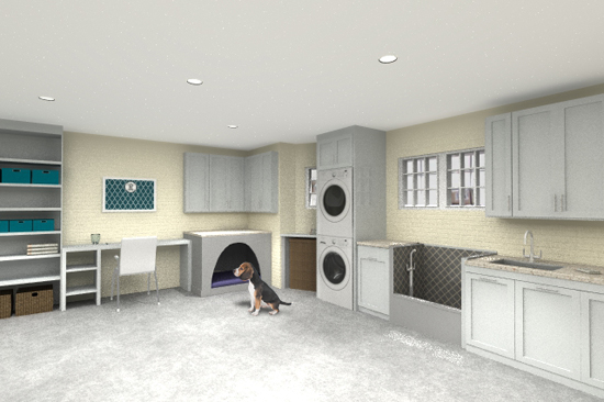
Re-imagined: A Spacious Laundry Room (with Doggie Amenities!)
The Basement
The unfinished basement has a lot of potential to become a useful, organized space with multiple functions. Weʼd give it a slightly higher level of finishing by covering the exposed ceiling and adding some can lights. Weʼd leave the exposed brick walls but paint them a bright, warm color. Weʼd paint the concrete floor a lighter color as well to give some new life to the room. A stacked washer dryer and some storage cabinetry would maximize space. Finally, a doggie washing basin and sleeping cubby would be a nice touch for any pet owner that has large, or multiple, dogs.
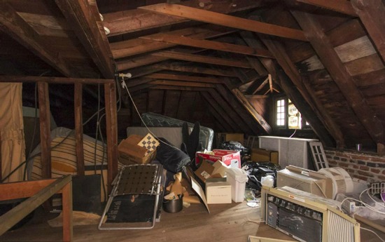
Currently: Unfinished and Underutilized

Re-imagined: A Useable Workspace
The Attic
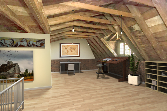
The attic space has relatively high ceilings and could make for a great artist studio, office, or general workspace. Weʼd keep the ceiling beams as-is for now, but lighten the wood flooring and add some exposed lightbulbs to brighten up the space. Weʼd add a finished section of drywall at left to make some space for hanging up in-progress artwork or drawings, with storage space on the far side. With the freed-up floor space, there would be plenty of room for a desk and drafting table, and any other artist or craft supplies. With a window overlooking the front yard, this space would make a great room for retreating to find quiet and inspiration.
Lori Steenhoek is a Digital Artist with over eight years of experience creating architectural renderings. She is the founder of Capital Pixel, a DC-based rendering company, and has her undergraduate degree in Architecture and a Masters in Animation and Visual Effects. She can be reached at lori@capitalpixel.com.
Cassie LaPorte has been a digital artist with Capital Pixel since April 2013. She received her BFA in interior design from Cazenovia College In NY. She can be reached at cassie@capitalpixel.com
Do you know of a home that needs some re-imagining? If so, drop us a line at editor2013@urbanturf.com.
Similar Articles:
* Re-imagined: A 1908 Chevy Chase Bungalow * Re-Imagined: Updating a Lanier Heights Co-op * Re-Imagined: A Victorian on the Hill * Re-imagined: Spiffing Up a Hillcrest Mansion * Re-imagined: A 1920s Trindad Row House * Re-imagined: A Truxton Circle Row House Overhauled * Re-imagined: An UrbanTurf Reader Request * Re-imagined: A U Street Row House
See other articles related to: chevy chase dc, dclofts, re-imagined
This article originally published at https://dc.urbanturf.com/articles/blog/re-imagined_refreshing_a_dated_chevy_chase_bungalow/7716.
Most Popular... This Week • Last 30 Days • Ever

In this article, UrbanTurf looks at the estimated annual maintenance costs associated... read »
A Home Equity Line of Credit, commonly referred to as HELOC, is a borrowing product t... read »
Nesso Plaza is scheduled to open early next year and several tenants have already sig... read »
Kevin Durant part of group buying Six Flags; the micro-transit program starting in Ar... read »
Spring came early to the DC-area housing market in March, with buyers shaking off the... read »
DC Real Estate Guides
Short guides to navigating the DC-area real estate market
We've collected all our helpful guides for buying, selling and renting in and around Washington, DC in one place. Start browsing below!
First-Timer Primers
Intro guides for first-time home buyers
Unique Spaces
Awesome and unusual real estate from across the DC Metro


