 The Changing Face of Columbia Heights and Mount Pleasant in One Chart
✉️ Want to forward this article? Click here.
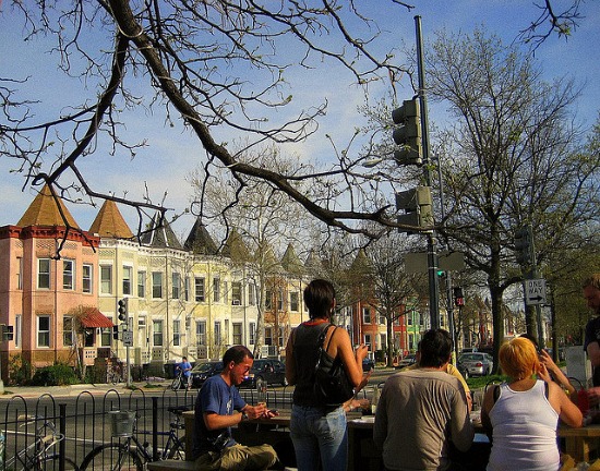
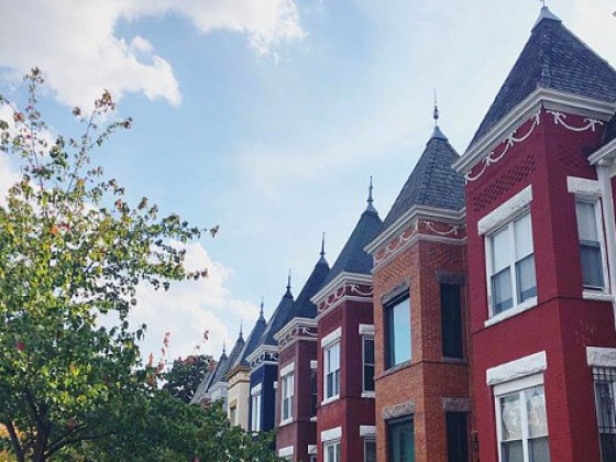
It is no secret that the demographic make-up of Columbia Heights and Mount Pleasant has transformed over the past several years. But now there is a chart which shows just how much the population has changed.
The Urban Institute recently released a comprehensive look at how the make-up of the city has changed, which included a short case study (in the form of a chart) on the two neighborhoods above.
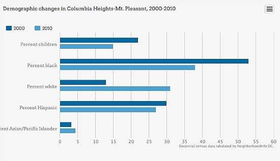
Here are the main takeaways:
- The percentage of white residents in the two neighborhoods jumped from about 13 percent in 2000 to about 31 percent in 2010.
- The percentage of black residents fell from about 53 percent to 37 percent.
- The number of residents with children dropped from 22 percent in 2000 to 15 percent in 2010.
The study has a number of other interesting examples about how the city has changed in recent year, including a map of the millenial invasion. Check it out here.
See other articles related to: columbia heights, dclofts, mount pleasant, urban institute
This article originally published at https://dc.urbanturf.com/articles/blog/the_changing_face_of_columbia_heights_and_mount_pleasant_in_one_chart/7916.


UrbanTurf Listings showcases the DC metro area's best properties available for sale.

Most Popular... This Week • Last 30 Days • Ever

In April, UrbanTurf looked at programs in the District that help homebuyers defray ... read »
Add another residential development to the growing pipeline in the Courthouse section... read »
Is the same buyer assembling a land holding above the Potomac?... read »

The new product, developed in partnership with mortgage lender Better Home & Finance ... read »

What is Zillow Preview; who are DC's speed cameras catching; and who is buying vacant... read »


DC Real Estate Guides
Short guides to navigating the DC-area real estate market
We've collected all our helpful guides for buying, selling and renting in and around Washington, DC in one place. Start browsing below!
First-Timer Primers
Intro guides for first-time home buyers
Unique Spaces
Awesome and unusual real estate from across the DC Metro