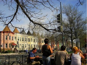
The Changing Face of Columbia Heights and Mount Pleasant in One Chart
It is no secret that the demographic make-up of Columbia Heights and Mount Pleasant has transformed over the past several years as they are two of the most prime examples of the changing face of DC. But now there is a chart which shows just how much the population has changed.