Northern Virginia Home Inventory Falls to 4-Year Low
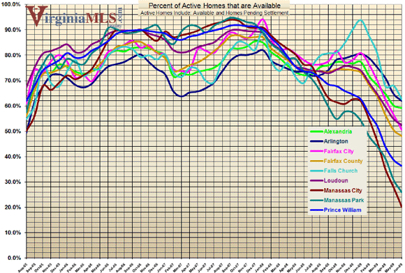
The total available for-sale housing inventory in Northern Virginia is at its lowest point in four years, reports the blog Northern Virginia Housing Bubble Fallout. According to statistics from the region’s multiple listings service, the number of available listings on the market is approximately 7,500. In 2006, the available inventory was almost three times that.
Northern Virginia is defined as Alexandria, Arlington, Fairfax City, Fairfax County, Falls Church, Loudoun, Manassas City, Manassas Park, and Prince William. In the outside-the-beltway counties of Loudoun and Prince William, available inventory is actually below July 2005 levels, further evidence that while those regions were hit first and hardest by the housing collapse, they have also rebounded the quickest.
There are two schools of thought on the Northern Virginia housing market. Some believe that it is well on its way to recovery, and that statistics like these prove their case. Skeptics argue that the current housing inventory numbers are overly optimistic because they do not include the “shadow inventory” of foreclosed homes that banks have yet to put on the market.
Below is a graph from VirginiaMLS.com of the available inventory for each of the nine cities and counties in Northern Virginia from August 2005 to the present. It shows how inventory swelled from 2005 to 2007, only to plummet beginning in early 2008.
This article originally published at http://dc.urbanturf.com/articles/blog/northern_virginia_home_inventory_falls_to_4-year_low/1155
Join the discussion
Most Popular... This Week • Last 30 Days • Ever

Last night, the ANC 2C Design Review Committee approved the concept and massing for... read »
Neighborhood Profiles more »
Friendship Heights: A Shopping Mecca With a Few Places to Live
Shilpi Paul
February 3rd | 1 Comment
If living in a city means enjoying a walkable neighborhood, having retail and public transportation... read »
- Friendship Heights: A Shopping Mecca With a Few Places to Live
- Bloomingdale: Where (Almost) Everyone Knows Your Name
- Downtown Falls Church: Staying the Same in the Midst of Change
- American University Park: One of DC’s Last Frontiers Before the Suburbs
- Cabin John: In With The New While Maintaining the Old
Editor's Choice more »
Rents Will Fall in the DC Area, But Not By That Much
Mark Wellborn
January 26th | 5 Comments
A strong apartment delivery schedule over the next few years will mean that rents will go down. But... read »
New Condo Profiles more »
EYA To Build Waterfront Luxury Condos in Old Town
Shilpi Paul
January 27th | 0 Comments
EYA CEO Bob Youngentob told UrbanTurf today that the firm will start construction on a 60-unit... read »
- EYA To Build Waterfront Luxury Condos in Old Town
- Preview: McGill Row
- Preview: The Newport Tower
- Preview: Harvard Row
- The Schafer: Mount Pleasant’s Mansion-to-Condo Conversion
The DC Condo Market more »
New Renderings for JBG’s Florida Ave. Project; Reatig Redesign
Shilpi Paul
February 3rd | 2 Comments
UrbanTurf has received the latest renderings for JBG's Florida Avenue project, as well as updates... read »
Green Real Estate more »
Pepco Buys Award-Winning Solar Decathalon House
Shilpi Paul
January 30th | 2 Comments
WaterShed, the University of Maryland-designed home that took top honors at the 2011 Solar... read »
- Pepco Buys Award-Winning Solar Decathalon House
- Real Estate Foundation Greenprint Partners With ULI
- Best Green Effort of Year: The Electric Car Charging Station
- Cohousing: Not Communal Living, But Close
- U-Md. Designed-House Wins Top Honors at Solar Decathalon
Deal of the Week more »
Deal of the Week: Gone in a Blink of an Eye
UrbanTurf Staff
January 17th | 3 Comments
About a month ago, UrbanTurf featured a three-bedroom home on 13th Street as a Deal of the Week.... read »
- Deal of the Week: Gone in a Blink of an Eye
- Deal of the Week: An AU Park Bargain
- The Deal of the Year: The Beautiful Foreclosure
- Deal of the Week: One-Bedroom Bargain in Cleveland Park
- Deal of the Week: The U Street Corridor Fixer-Upper
Renting more »
The Increase in DC Rents Is Slowing Down
UrbanTurf Staff
January 3rd | 6 Comments
DC area rents are still on the rise, but not surging like they have done in years past, and that... read »
- The Increase in DC Rents Is Slowing Down
- Ride On: Renters Willing to Pay More for Metro Access
- Best Tool for Renters Looking to Walk to Work
- Yale West Apartments To Begin Leasing Next Week
- First Phase of Sheridan Station Completed
Market Watch more »
Market Watch: Logan Circle, Columbia Heights, Dupont Circle
Keith Gibbons
November 28th | 5 Comments
Housing Market Watch returns this week after a little hiatus as Keith Gibbons takes a closer look... read »
- Market Watch: Logan Circle, Columbia Heights, Dupont Circle
- Market Watch 22101: McLean and the CIA
- Market Watch: The Rough Housing Market of 20032
- Market Watch: Condo and Co-op Heavy in the Southwest Waterfront
- Market Watch: 20816, A Seller’s Market
Unique Spaces more »
The Gym, The Stables and The Firehouse
Mark Wellborn
September 22nd | 0 Comments
These days, it is not that uncommon for a former school or a church in the DC area to be put up for... read »
This Week's Find more »
A Co-op For a Chef in a Classic Wardman
Shilpi Paul
February 2nd | 1 Comment
Thanks to a few renovations, the owners of This Week's Find brought style, space and multiple... read »
UrbanTurf Reader Asks more »
$330 a Month in Rent in DC?
UrbanTurf Staff
January 24th | 6 Comments
In this installment of UrbanTurf Reader Asks, a reader inquires as to whether or not the type of... read »
What X Buys You more »
What $700,000 Buys You: The Colonial Edition
Shilpi Paul
January 24th | 0 Comments
In What X Buys You this week, UrbanTurf takes a look at colonial-style homes on the market in the... read »
Best New Listings more »
Best New Listings: The $1 Million Edition (Week of Feb 3rd)
Shilpi Paul
February 3rd | 0 Comments
In this week's special edition of Best New Listings, we look at homes that recently hit the market... read »
- Best New Listings: The $1 Million Edition (Week of Feb 3rd)
- Best New Listings: Burleith, Dupont Circle, and Columbia Heights (Week of Jan 30th)
- Best New Listings: U Street Corridor, Chevy Chase, and LeDroit Park (Week of Jan 23rd)
- Best New Listings: Capitol Hill, Mount Pleasant and Woodridge (Week of Jan 16th)
- Best New Listings: Condos, Row Houses and Country Club Mansions (Week of Jan 9th)
Luxury Real Estate more »
DC’s Most Expensive Homes Not as Pricey As They Used to Be
UrbanTurf Staff
January 30th | 3 Comments
A new house recently hit the market in DC for $11.9 million, making it the second most expensive... read »


7 Comments
Count me amongst the Washington, DC, real estate watchers who think the Northern Virginia market has hit the bottom.
Interesting that the closer to DC, the lower the percentage of homes that are under contract. (Might have something to do with the fact that the further away from DC, the more prices have fallen…)
And count me among the people that is totally perplexed by this chart.
For one thing, it only goes back to 2005. How about a chart that at least goes back to pre-bubble days so we can have a more meaningful way to interpret the chart.
Finally, this chart does not give you housing inventory available per capita or total. It gives you the percent of active listings as a proportion of available listings. Maybe I’m just being retarded, but I don’t see how you can use these numbers to claim that inventory is at its lowest.
Suppose you have 2 billion listings yet 90% are pending. That doesn’t mean that inventory is at its lowest.
The chart is simply stating that there is less available houses on the market since 2004. The theory goes that less inventory= increased demand and thus….drum roll…RISING PRICES. Hang one everyone this could get interesting. Cheers.
I don’t see how this chart proves there is less inventory. There are plenty of inactive homes that are actually available but not yet listed on the MRIS. They are vacant, bank owned properties that are available right now (if you know the bank and who to contact) and they are about to be listed anyway.
To Georgetowner, you’re right that this graph doesn’t show absolute values but rather percentages. The ratio of available homes to total listed homes is an important metric that indicates demand. A low percentage of available homes means that demand is strong; a high amount means the opposite.
What would have been better to publish is graphs of the inventory in absolute numbers. I’ve linked them below for each city/county.
You’ll note that for the most part absolute inventory has dipped below July 2005 levels (Alexandria and Arlington are exceptions).
Alexandria City - http://www.virginiamls.com/charts/Alexandria.htm
Arlington County - http://www.virginiamls.com/charts/Arlington.htm
Fairfax City - http://www.virginiamls.com/charts/FairfaxCity.htm
Fairfax County - http://www.virginiamls.com/charts/FairfaxCounty.htm
City of Falls Church - http://www.virginiamls.com/charts/FallsChurch.htm
Loudoun County - http://www.virginiamls.com/charts/Loudoun.htm
City of Manassas - http://www.virginiamls.com/charts/ManassasCity.htm
City of Manassas Park - http://www.virginiamls.com/charts/ManassasPark.htm
Prince William County - http://www.virginiamls.com/charts/PrinceWilliam.htm
To John, I noted that shadow inventory means the published inventory statistics can’t be totally accurate. The question that no one seems to know the answer to is what the actual volume of shadow inventory is. Is it so much that it could push down prices, or not?