What's Hot: Most DC Home Sellers Are Still Realizing Six-Figure Profits | A Chevy Chase Castle Hits The Market
 The Latest Re-Design of the DC Metro Map
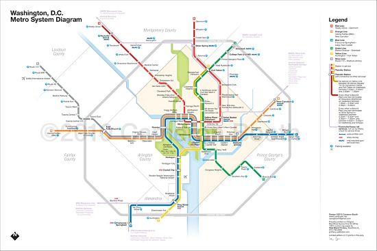
The DC Metro map has been reinvented by artists over the years, but a Portland-based graphic designer just released a fairly clean and intuitive re-interpretation that UrbanTurf is fond of.
Cameron Booth is a graphic designer with a 16-year resume with an admitted passion for transit maps. Having already done a poster of US interstates in the style of the London Underground’s Tube Map, Booth was looking for a new project when he decided on the WMATA map.
“I’m going to be blunt here. I simply don’t like the current one,” Booth told UrbanTurf. “Heresy, I know, but there it is.”
Booth’s “design brief” when approaching the project was to make the map as different as possible to the current one while retaining all information, cleaning up some errors (station placement relative to the District’s “diamond”, mainly), and adding the Silver Line. The new map has thinner route lines (to make the map look more elegant) and Booth added in Amtrak and MARC/VRE routes and connections to the map. He admits that opinions are divided about whether or not the inclusion of the Amtrak and MARC lines were useful, but like the map itself, his aim was to incite discussion.
“I designed this to inspire some debate about the current map,” Booth said. “Is it the ‘design classic’ that some people think, or is it a poorly-drawn, dated-looking relic of the 1970s?”
Booth’s re-interpretation is now for sale. For more info about the genesis of the design, click here.
See other articles related to: cameron booth, metro, wmata
This article originally published at https://dc.urbanturf.com/articles/blog/the_latest_redesign_of_the_dc_metro_map/2717.
Most Popular... This Week • Last 30 Days • Ever

This week’s Best New Listings includes a cozy home adjacent to the Arboretum, a pr... read »

In this article, UrbanTurf looks at the estimated annual maintenance costs associated... read »

Another concept has been unveiled for one of DC's most contentious development sites,... read »

The big news in the development pipeline east of DC's H Street Corridor is the resur... read »

Renter demand has continued to push Class A apartment rents in the DC region up this ... read »
DC Real Estate Guides
Short guides to navigating the DC-area real estate market
We've collected all our helpful guides for buying, selling and renting in and around Washington, DC in one place. Start browsing below!
First-Timer Primers
Intro guides for first-time home buyers
Unique Spaces
Awesome and unusual real estate from across the DC Metro


