Where Are DC’s Richest and Poorest Neighborhoods?

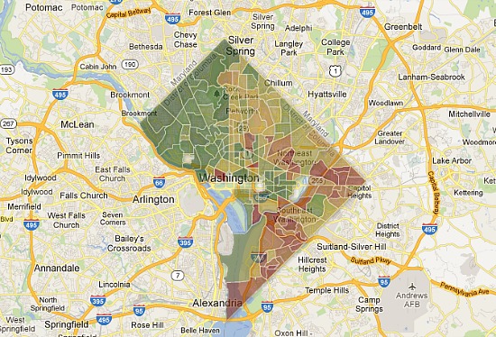
Courtesy of Rich Blocks, Poor Blocks.
Driving around DC, one can get a general sense of which blocks feel wealthier than others. Now, a new map provides a glimpse into the income breakdown of neighborhoods throughout the city.
Rich Blocks, Poor Blocks uses Census data from 2006-2010 to map out the median income of neighborhoods around the country. The scrollable, zoomable map fills in each area — bounded along Census tract lines — with a color scheme ranging from red to dark green to illustrate comparative wealth.
The greener an area, the higher its median income: the darkest green indicates a median income of at least $134,901, while the purest red means that the area is struggling with poverty, with a median income of $22,598 or less.
UrbanTurf spent quite a bit of time perusing DC’s map, and wanted a share a few observations about the income breakdown of the city, many of which fall in line with the changing face of DC over the last decade.

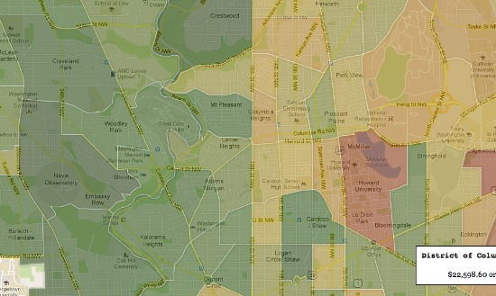
On either side of 16th Street NW.
16th Street is a dividing line.
The Northwest quadrant is generally greener than the rest of the city (no surprise there), but the starkest dividing line is 16th Street NW. To the west of the avenue, the greens are quite deep; to the east, the areas are often yellow, sometimes even tinged with red, indicating a lower median income.

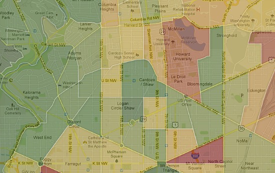
Logan Circle stands out.
Logan Circle and the U Street Corridor stand out.
Zooming into the center of DC, the greenness of two areas pops out: Logan Circle and the U Street Corridor. People often talk about how development is moving east, but the increasing wealth in the two hip neighborhood make them stand out. All the surrounding tracts are lighter in color.

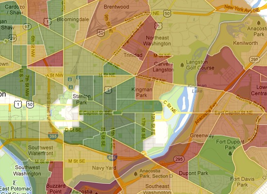
Capitol Hill’s wealth is spreading.
While the expected areas on Capitol Hill are solidly green, it’s interesting to note that even sections to the east and north of Capitol Hill proper are full of wealthy residents. Hill East, all the way to 19th Street and the Armory, is almost as green as the area around Lincoln Park, and the wealth seeps north to the H Street Corridor and just beyond.

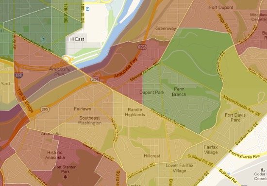
Both dark red and bright green in Wards 7 and 8.
East of the river neighborhoods range widely.
While Wards 7 and 8 have the most red areas on the map, there is some variability. Red covers areas near Anacostia and Congress Heights, but Hillcrest is yellow, tinged towards the green, and Dupont Park is quite a bright green.
A few anomalous areas pop up on the map: the blocks surrounding universities, like Howard and George Washington, show up as starkly red, likely due to the lack of income of the students living there. Some non-residential areas — the Mall, the Capitol — are whited out, but others, like parkland, are not. Still, the map is pretty fascinating.
This article originally published at http://dc.urbanturf.com/articles/blog/where_are_dcs_richest_and_poorest_neighborhoods/6478
Join the discussion
Most Popular... This Week • Last 30 Days • Ever

After we reported that homes in the DC area are spending a median of 11 days on the... read »
Neighborhood Profiles more »
Trinidad: The Difference 5 Years Makes
Shilpi Paul
February 15th | 27 Comments
Five years ago, the DC police department was setting up police checkpoints in the Northeast DC... read »
Editor's Choice more »
The Top 10 DC Zip Codes Where Homes Are Selling Quickest
Shilpi Paul
May 15th | 10 Comments
After we reported that homes in the DC area are spending a median of 11 days on the market, we... read »
New Condo Profiles more »
New Boutique Condo Project Coming to 17th and Q
UrbanTurf Staff
February 25th | 6 Comments
A Dupont Circle mansion is currently being converted into a four-unit condo development that will... read »
The DC Condo Market more »
18-Unit Condo Project in Adams Morgan Slated For July Delivery
Shilpi Paul
May 13th | 4 Comments
An 18-unit condo building on Champlain Street is slated for delivery in July with sales starting... read »
- 18-Unit Condo Project in Adams Morgan Slated For July Delivery
- Nine Unit Condo Project and Restaurant Coming to Bloomingdale
- New Animation Gives Size and Scope of Adams Morgan Condo Project
- A Planned 16-Unit Kalorama Condo Project Struggles With ANC
- 14th Street’s Central Union Mission Condo Project to Begin Construction in June
Green Real Estate more »
Harvest Home: DC’s Submission For the 2013 Solar Decathlon
Shilpi Paul
May 15th | 2 Comments
DC's entry into the Solar Decathalon is a net-zero home that generates energy primarily by... read »
Deal of the Week more »
Deal of the Week: U Street Condo Alternative With Rental Prospects
Shilpi Paul
March 26th | 7 Comments
While the price per square of this installment of Deal of the Week is fairly average, the lower... read »
Renting more »
14W Open For Move-ins Starting This Week
UrbanTurf Staff
April 26th | 5 Comments
14W, the 231-unit apartment building at 14th Street and W Street NW that began leasing in February,... read »
Market Watch more »
Market Watch: Logan Circle, Columbia Heights, Dupont Circle
Keith Gibbons
November 28th | 5 Comments
Housing Market Watch returns this week after a little hiatus as Keith Gibbons takes a closer look... read »
Unique Spaces more »
DC’s One-Room House
Shilpi Paul
May 2nd | 8 Comments
For those with the budget for a studio but the hankering for a house of their own, a one-room... read »
This Week's Find more »
Inspired By California in Takoma Park
Shilpi Paul
May 16th | 1 Comment
If This Week's Find looks a little out of the ordinary for Takoma Park, it's because it was... read »
UrbanTurf Reader Asks more »
UT Reader Asks: Does It Make Financial Sense To Pay Down My Mortgage Faster?
Shilpi Paul
February 14th | 15 Comments
In this installment of UrbanTurf Reader Asks, a DC homeowner with a growing cash flow inquires... read »
- UT Reader Asks: Does It Make Financial Sense To Pay Down My Mortgage Faster?
- UT Reader Asks: Will New Parking Regulations Lead to More Problems?
- UT Reader Asks: Will Buyers Pay More For Old Than New?
- UT Reader Asks: Will Condo Projects Provide Discounts to Buyers Working Without Agents?
- UT Reader Asks: A Roommate or a Tenant?
What X Buys You more »
What $760,000 Buys You in Del Ray
Shilpi Paul
May 14th | 1 Comment
In What X Buys You this week, UrbanTurf takes a look at properties on the market in the $750,000 to... read »
Best New Listings more »
Best New Listings: Grassy Yard, Pointy Roof, and Windows Galore (Week of May 10th)
Shilpi Paul
May 10th
In this week's edition of Best New Listings, UrbanTurf looks at a pointy-roofed Chevy Chase... read »
- Best New Listings: Grassy Yard, Pointy Roof, and Windows Galore (Week of May 10th)
- Best New Listings: Truxton Circle, Sears Home, Eastern Market Victorian (Week of May 3rd)
- Best New Listings: A Craftsman, A Cottage and A Co-op (Week of Apr 26th)
- Best New Listings: The DMV Edition (Week of Apr 19th)
- Best New Listings: Newly Built Modern, Forest Hills Co-op and a Rare Three-Bedroom (Week of Apr 12th)
Luxury Real Estate more »
$190 Million: The Country’s Most Expensive House
UrbanTurf Staff
May 17th | 0 Comments
A $190 million estate in Connecticut hit the market on Friday, believed to be the most expensive... read »


5 Comments
Interesting that the LeDroit and Foggy Botttom areas are so red, as well as other university areas of the city. They must be taking into account student salaries/incomes which are often part-time if not below part-time in their employment. If that is the case, this is not really a useful indicator of incomes or useful tool when comparing income hot spots to the real estate market. It’s interesting to see, but if someone is not familiar with the city and reviewed this data, they would be incorrect in identifying the trends of development in the city and where the income wealth of buyers is located.
Alex, I agree that it would be interesting to know whether or not the study incorporates student incomes. Personally, I don’t think it should. As a marketer, whenever we have done similar demographic studies, we typically haven’t included students as they usually aren’t considered permanent residents. Still, who knows. Assuming it doesn’t, however, I think the map is pretty spot on as far as where you can find the wealth. I live in the U Street/Logan area, as do many of my friends, and I know what kind of income it now takes to live there. I also continue to see a drastic change in the people who are moving into the neighborhood. I think you will continue to see the wealth increase in the areas of hot development, and I would imagine that it will to some extent affect those regions with which they share their borders. Regardless of anyone’s take on this, it is undeniable that there are major demographic changes happening in the District.
One area where there is a university and you don’t see red is around American University. One can either assume that the students don’t live in the area, which is likely considering the cost of renting or owning in the area, or the level of wealth is so high that even the combined students lack of wealth is only a blip on the radar
I call BS on this. While it is probably somewhat legit, there are three scions of billionaires on my Ward 4 block. It is unlikely that their incomes and net worth are accurately reflected in this, or else we’d be painted a darker green than anywhere. (we’re shown as a dark yellow).
Then again, that’s precisely why they all live on a nice, but unassuming block. They all prepped together, and generally shun the notariety.
And just to add, our household income is over $600K. While we are by no means rich, there’s something wrong when it says the average income on our block is $26K. There are only 14 households on our block, and no one on the block makes so little, that the numbers would play out that way.