What's Hot: Just Above 6%: Mortgage Rates Drop To 2022 Lows | Facebook Co-founder Lists DC Home For Sale
 Metro Lines and Median Income
✉️ Want to forward this article? Click here.
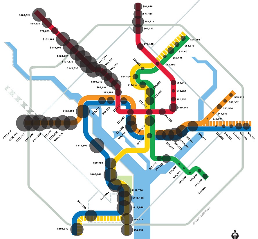
Inspired by a recent New Yorker interactive infographic that charted median income along subway lines, Chris Dickersin-Prokopp recently created a similar chart for the DC area for the City Paper.
Because Manhattan’s wealthiest are in a different stratosphere than ours, the differences in wealth distribution from stop to stop are more dramatic than those in the DC area. But with the idea that the metro is a great commuting equalizer, it is still interesting to see how income levels vary from one end of a line to the other.
In order to create the DC chart, Dickersin-Prokopp laid median income data from the American Community Suvery on top of Metro lines to see how income disparity varies. Some lines span more of a range than others; the Orange line is the “most volatile,” said Dickersin-Prokopp, reaching a median income of $142,000 at East Falls Church and $34,000 at Minnesota Avenue. (If we were being nitpicky, it would’ve been nice for the chart to include specific Metro stop names.)
For the full post, click here.
See other articles related to: wealth distribution
This article originally published at https://dc.urbanturf.com/articles/blog/how_does_wealth_distribution_fall_along_metro_lines/6988.


UrbanTurf Listings showcases the DC metro area's best properties available for sale.

Most Popular... This Week • Last 30 Days • Ever
Today, UrbanTurf is taking a look at the tax benefits associated with buying a home t... read »

Only a few large developments are still in the works along 14th Street, a corridor th... read »
Today, UrbanTurf is taking our annual look at the trajectory of home prices in the DC... read »

EYA and JM Zell Partners have plans for 184 townhomes and 336 apartments spread acros... read »
Chris Hughes and husband Sean Eldridge are putting their Kalorama home on the market ... read »


- A Look At The Tax Benefits of Buying a Home Through a Trust
- Church Street, U Street + Reeves: A Look At The 14th Street Development Pipeline
- The 10-Year Trajectory Of DC-Area Home Prices In 4 Charts
- 520 Residences Planned For Former GEICO Campus In Friendship Heights
- Facebook Co-founder Lists DC Home For Sale
DC Real Estate Guides
Short guides to navigating the DC-area real estate market
We've collected all our helpful guides for buying, selling and renting in and around Washington, DC in one place. Start browsing below!
First-Timer Primers
Intro guides for first-time home buyers
Unique Spaces
Awesome and unusual real estate from across the DC Metro