Metro Lines and Median Income
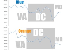
Inspired by a recent New Yorker interactive infographic that charted median income along subway lines, Washington City Paper just published a similar chart for the DC area.
Inspired by a recent New Yorker interactive infographic that charted median income along subway lines, Washington City Paper just published a similar chart for the DC area.