 The Difference That Seven Years Makes in the Demographics of DC
In light of data from the American Community Survey being released last week, UrbanTurf is taking a series of looks at how the demographics of the District changed between 2009 and 2016.
On the surface, the two tables below confirm many things we already knew about the District in recent years: the city is becoming younger, wealthier, whiter and more densely populated. UrbanTurf highlights some interesting changes in the bullet points below.
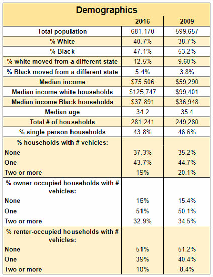
General population, household and income demographics
- The median income in the District has ballooned from $59,920 in 2009 to $75,506 in 2016; however, that prosperity hasn’t been shared proportionally across racial groups. While the median income for white residents rose from $99,401 to $125,747 over the seven-year span, median income for Black residents barely budged, rising from $36,948 to $37,891. Considering that Black people are still a plurality in the city’s population, this income gulf illustrates the extent to which the wealthy have increasingly chosen to settle in the city.
story continues below
loading...story continues above
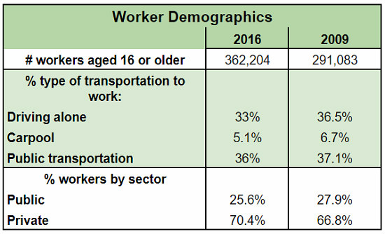
- The data above seems to corroborate a recent Bike League analysis showing that the number of bike commuters grew by 46 percent between 2011 and 2016, with the proportion of commuters driving alone dropping by a few percent. The trajectory is much less flattering for public transportation, which hasn’t reaped the benefits of a larger population due to a smaller share of workers riding the bus or train to commute.
While the data also shows that fewer people are carpooling, the survey does not yet have a measure to tally those who rely on carshare programs like Uber or Lyft. Another surprise statistic is that more renters now own two or more vehicles, perhaps due to there being more luxury apartment stock to offer options to multi-car households or more car-owning renters living with car-owning roommates.
Worker demographics
- A shift that may come as a surprise is that there were fewer single-person households in 2016 than there were in 2009, a dynamic that could be attributed to residents attempting to secure more-affordable living arrangements.
- DC’s reputation as a government town continues to be undermined by the data, which shows that the proportion of city residents who work in the public sector has shrunk by over 2 percentage points since the recession.
Overall, the data makes it apparent that the city has a long way to go to ensure that economic prosperity is shared by all its residents and that the long-beleaguered Metro has a long way to go to become an attractive option for car owners and commuters.
Thumbnail photo courtesy of Ted Eytan.
Correction: The total population numbers for 2016 and 2009 were misstated in the table in an earlier version of this article; those have since been corrected. The description of how many city residents work in the public sector has also been corrected to align with the data shown.
See other articles related to: census, demographics
This article originally published at https://dc.urbanturf.com/articles/blog/then_and_now_dcs_demographics_since_the_recession/13029.


UrbanTurf Listings showcases the DC metro area's best properties available for sale.

Most Popular... This Week • Last 30 Days • Ever

DC's homebuyer assistance programs can be a bit complex. This edition of First-Timer ... read »
When it comes to financing a home purchase, a 30-year mortgage is one of the most com... read »
Pocket listings are growing in popularity in the low-inventory market in the DC regio... read »

Plans for the development at a prominent DC intersection began nearly eight years ago... read »

The eight-bedroom, 35,000 square-foot home in McLean originally hit the market in 202... read »


DC Real Estate Guides
Short guides to navigating the DC-area real estate market
We've collected all our helpful guides for buying, selling and renting in and around Washington, DC in one place. Start browsing below!
First-Timer Primers
Intro guides for first-time home buyers
Unique Spaces
Awesome and unusual real estate from across the DC Metro