 The Two Charts That Explain the Climate in the DC Housing Market
The DC housing market has been characterized by two trends for the past couple years: chronically low inventory and high demand.
There were indications that the inventory trend, at least in the region, may have started to turn in March, but two charts for the first quarter of the year show that in DC proper, things remain the same.
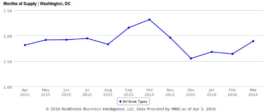
Inventory of homes for sale in DC.
The inventory of homes for sale in DC remains quite low. In March, inventory stood at 1.8 months, despite increasing from last year. Inventory was even lower in January and February, dropping to 1.5 months of supply in December. The standard benchmark for a balanced housing market is six months of inventory. DC has been below the two-month level for six months.
story continues below
loading...story continues above
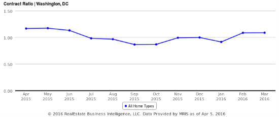
Ratio of contracts to active listings.
The reason for the lack of inventory is illustrated in the second chart above. The ratio of contracts to listings on the market in DC has been above 1.0 for the last two months. This means that active listings are receiving at least one contract, and in many cases more. Just last week, a reader wrote in letting us know that he won a bidding war for his new Columbia Heights home — his offer was one of 16.
This article originally published at https://dc.urbanturf.com/articles/blog/the_two_charts_that_explain_the_dc_housing_market/11113.


UrbanTurf Listings showcases the DC metro area's best properties available for sale.

Most Popular... This Week • Last 30 Days • Ever

DC and Virginia lead the way in terms of where prices have risen the most this year.... read »
When it comes to financing a home purchase, a 30-year mortgage is one of the most com... read »

Bright MLS reported that DC-area home prices approached record highs in March as new ... read »

Pocket listings are growing in popularity in the low-inventory market in the DC regio... read »
The London-style carriage house was originally built in 1892 as part of the Frasier M... read »


DC Real Estate Guides
Short guides to navigating the DC-area real estate market
We've collected all our helpful guides for buying, selling and renting in and around Washington, DC in one place. Start browsing below!
First-Timer Primers
Intro guides for first-time home buyers
Unique Spaces
Awesome and unusual real estate from across the DC Metro